NOTICE

All material in this blog falls under the laws of Copyright. Each Artist represented retains their own copyright to their images.Reproduction without their written consent forbidden by law.

Monday, December 27, 2010

Featured Artist...Bob Hudak

I thought we would end this year here, where I live, South Florida, with images best shown by our      current "Featured Artist" Bob Hudak. His views are classic photography, large format and yes film.      
Self taught, he leaves his former life as pilot flying air taxis, throughout Florida and the Bahamas where he develops his taste for the landscapes he sees.                                                                                 


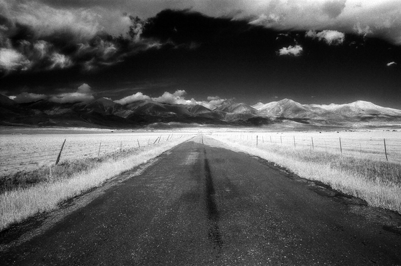
Bob takes his influence from one of the      greats, Edward Weston   and makes black&white photography his choice of expression.
"The photographs shown here were produced from negatives made with large format cameras. Originally, because of its relatively small size, the 4 x 5 inch view camera was my camera of choice. However, with my increasing interest in the contact printing processes and my aversion to making enlarged negatives, the 5 x 7, 8 x 10 and (soon) larger formats more likely will get the nod. However, the use of these relatively small camera sizes, in comparison to 8 x 10 inch and larger cameras, does offer a wider range of flexibility when it comes to printing. With certain subjects these negatives can be printed as contact prints or when needed as with a large landscape the 5 x7 inch negative can produce 16 x 20 inch prints of outstanding quality.
"


Since 1984, he has worked for various publications on travel adding commercial work in Architecture, Aerials, and Yacht photography and supplying stock agencies with his images. Florida becomes his choice for his work.

"My reasoning behind the Florida trips was that while the West in general and more specifically Montana does have a lot to offer the photographer working in the landscape I do not live there, and while I have returned many times it has been mostly with a fly rod to fish on the Madison, Yellowstone and numerous other rivers and streams around the state. To do something productive with a camera would require repeated visits to easily accessible, visually interesting areas; in short, I felt I needed to stay closer to home base.

The Florida that I grew up in, that is to say, South Florida in the late sixties, seventies and early eighties is, unfortunately, gone. Today’s post Disney version of Florida bears little resemblance to that period of time before the floodgates were opened and the mass influx of new residents hit my part of the state. The booming population and the infrastructure needed to support it, guaranteed that the lakes and woods used by myself and my friends as our escape from the real world would soon be filled in, paved over and lost forever under a sea of concrete and asphalt, never to be seen again except in memory."


His love of the outdoors continues to draw his attention adding to an over 16 year project dedicated to personal vision and viewpoint.
"As a photographer working with a landscape that now exists only as a fraction of the place you once knew, the challenge is to bring an awareness to the land through your photographs without resorting to sentiment in the hope of protecting what little we still have left, knowing that loosing this, it too is gone forever.
With these photographs my hope is to engage the viewer in a way that conveys not only a love of the land but also acknowledges the presence of something spiritual. Not spiritual in a biblical meaning, but something deeper, more to do with the belief that there is this unseen force in the universe larger than ourselves we can’t understand and that science and religion can’t explain. More than once it has been suggested to me that my photographs of the Florida landscape have been subconsciously my attempt to bring back the Florida that was, and in doing so recapture my youth and that, which disappeared with it. I’ve never had an intelligent reply to that comment; however if these images succeed at all then maybe what I’ve been doing for the past eighteen years hasn’t been a search for what I’ve lost of myself, but rather a search for the manifested Gods that are to be found within these lands."
For more of his work

Monday, December 20, 2010

Merry Christmas to all

Wishing all a very Merry Christmas... and a healthy, happy and successful New Year..

Monday, December 13, 2010

Featured Artist...Yvette Worboys


It's always good to see what is happening around
the world in photography. Some come from "Across the Pond" but Yvette Worboys hails from " Down Under, " Sydney Australia to be exact. Her graphic design background shows in her work "ghosts"

   
Yvette is a professional photographer and has been working within the industry since 2002. Yvette began her creative career as a graphic designer and she combines both her love of design and photography within her work. After completing her studies in 2003 Yvette began working in the domestic portrait market while continuing to pursuer her love of fine art photography. She has been a successful exhibiting artist in Australia being selected for various shows including the prized Olive Cotton Award for portraiture.


 Yvette is currently working on a body of work using color and shapes as the main focus of the images. This body of work will hopefully be exhibited in Sydney Australia in 2011. She uses a vast array of equipment from the iPhone 4 Hipstamatic camera, Lomography cameras such as Holga, Canon 35mm film and digital cameras and a Bron 6 x 6 film camera. Her post production process involves mainly Photoshop however Lightroom is used for batch processing and selecting of images.

 Yvette wishes to capture not just the person or place she is photographing but also the stories behind them, as evident in herCommunity exhibition, a study on the northern NSW town of Mullumbimby, Australia. This exhibition told the stories of the town from the local’s perspective. This exhibition was held in Sydney and then travelled to Mullumbimby.
Her work below right is from "Surrealist"

More of her work can be seen here 

Monday, December 6, 2010

Featured Artist...Stuart McCall

This week we receive work through the eyes of Stuart McCall, a Vancouver, BC based photographer, who shows us his panoramic scenes of the deserts of Nevada and northern Mexico.
He began his career as a commercial photographer in 1982. Since then, his images have been published widely, featured in  Time Magazine, Fortune Magazine, Saturday Night, Photography Monthly, Boston Globe, Times of London, as well as in books by National Geographic and Douglas & McIntyre. His work has been recognized by Communication Arts, the Lotus Awards, and International Photography awards.


"The desert has fascinated me for some time.  It is a place where the climate and environment are quite incompatible with human survival.  Scarcity of water, and extremes of heat and cold are typical…  Yet people have been inhabiting and trying to make a living in deserts since time immemorial. Many come, but few stay on.   The extremes of climate have the ability to preserve traces of past activity in a remarkable way that is not so much the case in wetter or more moderate climate.  Structures, roads, footpaths, machinery, fences, and garbage heaps tend to linger on in an unnatural way, far beyond what their creators anticipated.  I have for the past several years developed a keen interest in remains left behind and eventually becoming a part of the landscape.  The deserts of western North America are wonderful places to study this." 

He completed his series of desert scenes in 2010, using small digital equipment as series of overlapping frames,combined in post-production,creating a seamless panoramic image that really shows it better effect here .  He has been experimenting with this technique for a couple of years and found the possibility of extremely high image quality with the convenience of small format appealing.

"The desert has fascinated me for some time.  It is a place where the climate and environment are quite incompatible with human survival.  Scarcity of water, and extremes of heat and cold are typical…  Yet people have been inhabiting and trying to make a living in deserts since time immemorial. Many come, but few stay on.   The extremes of climate have the ability to preserve traces of past activity in a remarkable way that is not so much the case in wetter or more moderate climate.  Structures, roads, footpaths, machinery, fences, and garbage heaps tend to linger on in an unnatural way, far beyond what their creators anticipated.  I have for the past several years developed a keen interest in remains left behind and eventually becoming a part of the landscape.  The deserts of western North America are wonderful places to study this." 

Stuart has several projects which have been in various exhibitions . Hos work continues to evolve with his current approach.

" The notion of a planet absent of human beings has been of interest for some time, and has been cause for expression in my work.  While many imagine a future where man and nature will return to a state of equilibrium, my current work considers a world where nature is gradually reversing the effects of a brief encounter with humanity."
More of his work can be seen  here

Monday, November 29, 2010

Featured artist...Walt Stricklin


With over 35 years in Photojournalism, Walt Stricklin takes inspiration from David Hockney  and turns his focus on fine art.

As Director of Photography at the Birmingham News  for the last 15 years, Stricklin applies his new vision for landscapes earning him an invitation as one of ten American photographers to go to China and be part of an inaugural exhibition and conference at The Art Palace in Xiang Sha Wan, inner Mongolia.

 
"I call my pictures "Scapes" because most of the (so far) are landscapes and city scapes. They are preconceived, digitally hand crafted and not stitched or blended by  a computer program. As I do them, I am not looking for perfection in their assembly. I leave the many individual imperfections to celebrate both my humanity and the enjoyment of discovery. My composite panoramic Scapes are my visual sculptures. I want them to be a blend of reality and my interpretation of a given situation. "

  
His composite panorama "scapes" are preconceived, digitally hand-crafted and not stitched or blended by a computer program. 

"I am not looking for perfection in their assembly. I leave the many individual imperfections to celebrate both my humanity and the enjoyment of discovery. "
"... As an artist, I search for those everyday places and events in our lives that represent the universal truths of shared experiences. What is true in our core is true no matter who we are, where we were raised or where we end up."


More of his interesting work can be seen..here

Sunday, November 21, 2010

Featured Artist ...Ellen Jantzen


Ellen Jantzen's ghost like images have been referred to as " photo-synthesis"  Her new body of work appear spiritual, as portraits of the soul within the body. Her book, " Alternative Realities" can be found here shows her vision. It also appears in Amazon, here

Reality of Place

    I am intrigued with how a person adapts to their environment; how they are absorbed and changed. I set about to address this through a photographic photosynthesis in this body of work.
    Having recently moved to the Midwest after living in Southern California for 20 years I was, at first, unimpressed with my new surroundings. But this move has changed me and impacted my work by forcing me to deal with the reality of a given place. It has helped me pay attention to and appreciate the details of diverse environments. 
    Having always been intrigued with various aspects of reality, I chose photography as the medium to help me reveal/obscure truths. Traditionally, photography was viewed as an honest replication of the real world. But, as we all know, even from its inception, photographers used their medium to alter, accentuate and eliminate aspects of the "authentic". As I deal with these issues, I've come to realize it is all about the landscape, the environment…. fitting-in, disappearing, blending-in, and perhaps, ultimately embracing.
    In this new work, I have placed my husband (Michael) in various landscapes and in various poses to both highlight and obscure his presence while celebrating the reality of place.


She was born and raised in St. Louis Missouri. Her early college years were spent obtaining a degree in graphic arts; later emphasizing fine art. Upon graduation she and her husband, Michael, settled down on acreage in Southern Illinois and set about to construct several solar and energy efficient structures including their 2400 square foot home. Organic gardens and goat husbandry took center stage in Ellen’s life but a desire for a more “artistic” life led the couple to Los Angeles California.

Ellen spent two years at FIDM (the Fashion Institute of Design and Merchandising) in downtown Los Angeles. Here, she obtained her advanced degree in 1992. After a few years working in the industry, including several years at Mattel Toy Company as a senior project designer, she became disillusioned with the corporate world and longed for a more creative outlet. Having been trained in computer design while at Mattel, Ellen continued her training on her own using mostly Photoshop software.
As digital technology advanced and the newer cameras were producing excellent resolution, Ellen found her perfect medium. It was a true confluence of technical advancements and creative desire that culminated in her current explorations in photo inspired art using both a camera to capture staged assemblages and a computer to alter and manipulate the pieces. Ellen has been creating works that bridge the world of prints, photography and collage.

Ellen’s work has been shown in galleries and museums world-wide as well as numerous web-based sites.


More of her other work can be seen here..http://www.ellenjantzen.com/

Sunday, November 14, 2010

Featured Artist Kelly Fitzgerald


This week we are featuring member  Kelly Fitzgerald , an American born artist best known for her black and white film landscapes. 
Her selection here is from her recent work, "Colorado" from Infra-red film.

"...Photographing Colorado has been a dream of mine for over 25 years.  The first time I was inspired was when I looked through a black and white landscape photography book that had been given to me as a gift.  I saw these gorgeous landscapes of nature that had been taken by the photographer Ansel Adams.  From that moment, I knew that I wanted to experience Colorado first hand and explore its scenic beauty and history.
Dreams do come true.  With 3 camera bodies in tow, along with the very last of the discontinued Kodak Infrared High-Speed Film, I got to travel to Colorado this past September of 2010.

Fitzgerald strives to create works that capture and preserve the beauty in nature and in vanishing places – images that will inform the viewer and convey her deep belief in the value of these amazing places.


Fitzgerald discovered her love for art and photography at an early age.  In 1985, while living on the island of Kauai, she decided to move to San Diego, California to pursue her passion of the arts.  She enrolled in the photography/art program at San Diego City College.  She also studied oil painting and charcoal drawing at the San Diego Art Plex.


Fitzgerald is a black and white landscape specialist using tools such as manual film cameras, black-and-white film and the traditional darkroom to create her silver gelatin fiber base and Type C prints.  


Her photographs have been in numerous exhibits throughout the United States and Europe.  Fitzgerald's work has also won several awards including The Golden Light Award and the IPA Lucie Award.  She was honored at The Hubbard Museum in Association with The Smithsonian Institution in 2003, and was the first photographer to receive the Gene Harrison Memorial Award in November of 2003.


July of 2009, she wrapped up a 5 year project called "A New Discovery" ~ Black & White Infrared Film Landscapes of the Hawaiian Islands.  This past year, she was chosen to be a part of the Calumet Ansel Adams Tribute Video.  Her image "Shipwreck Beach - III, Lanai" was featured in the video.


More of her collections can be seen here 


Sunday, November 7, 2010

Featured Artist of the Week...Charles Hedgcock

Equally at home photographing in the studio or in the field, Charles "Chip" Hedgcock has been a professional photographer for more than 20 years. He is a member of the American Society of Media Photographers (ASMP), the Stock Artist Alliance (SAA) and is a Registered Biological Photographer and Fellow of the BioCommunications Association (BCA).


"I have a deep interest in natural history that has led me on photography and research projects in the American southwest and Sonora, Mexico.

For my personal art work I prefer the classic tools of my trade; film and archival silver gelatin prints. My images often focus on arthropods (insects, arachnids, crustaceans, millipedes, centipedes) and herps (reptiles and amphibians). What I like to call the “Charismatic Microfauna”.


His award winning photography has been called "beautiful in its precision." by the Austin American-Statesman. It has appeared in an eclectic mix of publications including; SpinRanger RickCell & Tissue ResearchBBC WildlifeOutdoor Photographer and the Journal of Biological Photography. A gifted fine art photographer, his work has hung in numerous galleries as well as natural history museums and botanical gardens.

Brooks Jensen, editor of Lens Work, had this to say about his work:"Chip is to bugs what Weston was to peppers!"


"I enjoy photographing animals in the studio because of the control it affords me. Control not just of my subjects, but perhaps more importantly, control of the light.  Photography is “painting with light” after all, and I feel that working in the studio allows me to paint with a fine brush. This helps me to bring out the sculptural and luminous qualities of my subjects. All subjects are photographed alive and when possible, released back into the environment from which they came unharmed."

More of his work can be seen at
http://charleshedgcock.com/index.html

Monday, October 25, 2010

Featured Artist of the Week..Eric Smith

Eric Smith has many exhibits to his name. His work ranges from studio to editorials in documentary fashion. But he doesn't let his commercial side get in the way of his Art side, but rather uses it to bring him closer to the experience. His technique lends itself to his subjects shown here in his series:

Roll Mill
He says in his statement:
I create instinctually.  Time, place, light, and chance: these are the elements from which my photographs are formed.  My images are never preconceived or contrived.  Instead, my work is firmly rooted in that gap which exists between seeing and comprehending: that place which reveals, but also questions, the truth. 

I examine reality. 
Our world is ambiguous and filled with contradiction and uncertainty. Hope and cynicism.  Solemnity and absurdity.  Beauty and ruin.  My photos explore these incongruous experiences and emotions, and documents their opposition.  Essentially, photography allows me to question the indefinite relationship between reality and perception.  My work is a constant journey towards authenticity.

I foster discovery.  A compelling image is one which reveals something unexpected, even if the material is truly mundane.  Photography is a medium which provides the viewer not only the opportunity to observe and detect, but also to emote and respond.  My photos are evocative, suggestive, and reminiscent: their subjects are self-explanatory, yet call into question one's usual perception of time and space.  My work continually examines how the ordinary is really quite extraordinary.


Oxygen Plant


Roll Steel Warehouse


 Drive Gear
" Photography allows me to question the indefinite relationship between reality and perception.  My work continually examines how the ordinary is really quite extraordinary. "More of his work at www.ericsmithphotography.com

Friday, October 22, 2010

Featured Artist of the Week..George L. Smyth

This week we welcome George L Smyth
He began to seriously study photography upon his return from an extended trip to Wales in 1990. After experimenting to find his personal style, he decided to concentrate on pinhole, infrared and alternative process photography.

A member of the Bowie-Crofton Camera Club since 1992, the largest in the Washington-Baltimore area, he has won numerous awards, including Photographer of the Year in 2009. He is a regular lecturer on pinhole and infrared photography, and has offered numerous presentations to area clubs, as well as presenting to PhotoPro Expo twice.

His work is Bromoil  is a labor intensive process made out of love. Below his examples with his accompanying stories:
 Early Morning Meeting

It was certainly long in coming, but they say that the best things take time.  What "takes time" is the connection, and oddly enough, that had been the easy part.  He hadn't even considered sharing his plans by starting at the top, but here he was, and this was his time.  Spotting his contact across the room, he entered and presented his offering, which he hoped would be the first of many.
  
  Encounters....  the cover of his book  "The Extras"..

Nothing was the same.  Nothing.  Many things were better, but is better always better?  A hunger built up in her throat as she found her way through the crowd.  The things she had known all her life, and from which she had run, were familiar but not comforting.  This new unknown was a hurting thing, but the abundance of the new life acted as a counterweight.  She was not sure if she would ever forget her past pain, but perhaps her children would be spared.

George's other work can be seen at his website . He also maintains a blogsite... sharing more  work with stories..

Thursday, September 30, 2010

Self Publishing Photo Books


I have come to some conclusions on self publishing books based on my experience with 3 companies.. A&I.. MyPublisher..and

Mac(through IPhoto}  Which is the best?  It all depends..


If you're thinking of all those coffee table books in the stores you see, well forget about it. There is no way to expect the same results. You can however expect some good results if you're aware of the things each of these three have to offer and judge if what you are sending can take advantage of it.  

None of them have a real Profile to offer, something that would be really great when you prepare your files. None send a proof or at least an online one,,too bad...Profiles are based on paper quality and ink runs and can show you pretty much how your images will reproduce as long as your monitor is "COLOR BALANCED" properly. That means with some device and program and the ability to adjust your monitor accordingly. There are a lot of them but I use a Spyder from XRite. PC or Mac doesn't really matter but PhotoShop (C-3-4-5) is a norm. 

Your files (images with or without text) comes #1.. for most images I use Adobe's RGB98 file a standard with PS.. for starters..There are other settings but that is middle and recognized ground that fits a printable gamut range (for those who wish to melt their brain). Once I like the results, I then make a copy to refer to, and convert or assign an sRGB profile to it. Almost all printers use sRGB so the point of debating its smaller gamut is useless..adjust..resistance is futile!!  At that point,I size them according to the final size of the pages of the book or a larger size and scale it down with their provided software. Then I add Smart Sharpen and followed by Edit / Fade Sharpen Lens Blur... From my magazine clients, that seems to work best although I do change profiles for them to Color Match but that's another story..later. 

Some want jpeg and some take a Tiff..whatever, most keep it at 300PPI to 350PPI..  In Jpeg mode see if their guidelines call for "Baseline standard or Optimized..." at Maximum quality. Put them in folder "Images ready for book" or however you can refer these as. 

I noticed  in the end, for best results adjust your histogram from 5- 240 lowest black to the highest whites..with a slightly lower saturation in the reds.. their papers seem to pump reds, at least in my case for all three.

Now while all three offer book themes and templates..I found that creating the size pages you want in PS by File/New/ and filling in the required info..  and doing your own layout with whatever size images you select for the page,add type and a background color if not white, works the best. Upload  them as full page choices and it turned perfect if you allow some room for images or let them bleed off the page.. in other words don't put important stuff on the edges that you can't give up!

DECISION TIME..who is best ? 
Layouts: All offer a free program download for their layouts..
Mac has a simple one but limited in designs..Unless you make your own layouts mentioned above, but quick to use and uploading and ordering is simple as well. 
A&I and My Publisher have more designs and themes, not as easy to use, but you can catch on.

Covers: all offer hard and soft bound..here I used Hard bound except for a small 3.5x2 inch book only offered from Mac..very cute
All 3 have a printable sleeve jacket over their cover like a book wrapper..  
My Publisher on the other hand offers both jacket and printed on the cover itself...really really nice,snappy .
Both Mac and MyPubisher return the book in a see through envelope to keep it clean..A&I just returns it , cheap on their part for a more expensive product .
A&I and Mac have the best binding..clean and tight..MyPubisher a little less neat on the spine, but that could just be mine, I did two with them.
PAGES:  
A&I definitely has the best paper of the three, thicker,smoother nice feel in quality.They are a higher end in quality all over. Mac is second...MyPubisher not bad, acceptable.Depending on what you are printing like if its B&W..I would go with the better paper but I would convert my B&Ws to rgb.  For pastels in colors..Mac is best IMHO. A&I needs around 240 in the highlights..

Delivery: 
A&I is the slowest..Mac the fastest..MyPublisher is average. 

Deals:
MyPlublsher has the very best...the other two offer none.

All that being said...I was happy with all three.I would adjust my histogram for the next round as mentioned above... All three have decent reproduction except MyPubisher liked reds so for for them I would desaturate red 15-20%  

I liked MyPublisher's cover best, very attractive nice repro on it. Mac reproduced all over very well..A&I needs 240 in the highest whites as mentioned above..they were the most expensive. 

Doing your own books becomes a fever, like tattoos, and a lot of fun, keeping it simple is hard but best in the end results.. All in all, it is a cool and inexpensive way to show work and do a promo piece.. I use Mac's 2x3.5 book as my FOOD give away to potential clients..

I will try some other companies and post on them as well.


Comment on your results 


Monday, February 22, 2010

Technology And The Traditional Process Photographer


In one of our posted discussions, we talk about what defines a fine art print. This might be a good example shared with us, by George Smyth and his Bromoil method.

-------------------------------------------------------------------------------------------------------------
..George Smyth...
Despite an apparent resurgence of interest in traditional film photography, digital imaging is quickly pushing silver gelatin print creation into the miscellaneous category known as alternative processing. Those of us who have spent a lifetime working with this traditional process may feel a sense of loss, but the truth of the matter is that it can open a new set of possibilities.
For years I have worked with the Bromoil process, which was first popularized about one hundred years ago. Other than the silver gelatin process, it is the only alternative process that allows for projection, as opposed to requiring direct contact of the negative with the paper. As many people have never seen a Bromoil print (I had not seen one at the time I started making them), I will first explain what a Bromoil print is, then explain how current technology can facilitate the process.
The creation of a Bromoil print involves a number of steps. The first is the creation of a traditional darkroom print, but that is used as a guide print to reference at a later time.

A second print is made, normally exposed twice as long as the guide print under the enlarger, and given a grade less contrast. This is the print that will eventually become a Bromoil, but must first be dried overnight.

The following day the print is bleached and tanned. Typical photographic bleaches merely remove the silver from the print, but the type used in this process also tans the print. This means that it hardens the emulsion relative to the amount of silver that was in the print. Areas that held shadow values will have the emulsion hardened considerably, whereas the highlights will have had the emulsion hardened very lightly. The paper must then be dried again overnight.

Finally the print can be inked. To begin, it is first soaked in water for about 15 minutes. This allows water to saturate the emulsion, and will do so relative to its hardening - the softer the emulsion, the more water that area of the print will hold, the harder the emulsion the less water that area can hold.

The paper is then removed from the soak and all surface water is removed, so the only water remaining is within the emulsion. It is laid on a sheet of glass to keep it flat and provide a hard backing. A stiff brush, often made with hog's hair, is tapped on ink-covered tile to charge it with ink, and then with various tapping motions of the brush, the ink is transferred to the paper. As this is done, the highlight areas (where the emulsion holds the most water) reject the ink, while the shadow areas (holding little water) accept the ink. Eventually the paper will dry out and need to be resoaked before more ink can be properly applied.

After several thousand taps of the brush on the paper, the image is ready to be dried, touched up, and displayed.

Digital technology, for me, has an important place to play in the process. As time goes on, the number of papers that can be used with the Bromoil process become fewer and fewer. Older papers, like Kodak Ektalure and Agfa MCC118 are no longer produced, so old stocks become more and more dear. The last thing I want to do is to waste any of this precious stock with test strips and errant exposures.


The ability to create a digital negative means that I can contact print any image that I have taken. Equally important, as a paper like Kodak Ektalure is a single contrast paper, as long as I have matched a curve for it, what I see on my monitor can be reproduced in the darkroom.

The take-away is that a new technology can open capabilities with older technologies. In my own particular case, I will not only be able to create more Bromoil images from my stock before having to rely on more modern, and less capable, papers, but since I do not have to run tests before making a final print, I can be more productive with this time consuming, labor intensive process.
-----------------------------------------------------------------------------------------------------------------
For more info on this process...http://www.alternativephotography.com/process_bromoil.html
and... http://www.edinphoto.org.uk/1_early/1_early_photography_-_processes_-_bromoil.htm

Monday, February 8, 2010

Pigmented Wax Prints


This week's blog, features another member, Walt Jones and his method, adding another way of presenting images, an ongoing discussion on our group....

from Walt...
Finding the (wax) print

Plenty of people will disagree with me on this, but I’ll claim that the vast majority of so-called “fine art prints” come from a pretty narrow set of methods. On the digital side, you mostly have your Lightjet print and your pigmented ink print. Film, having been around a lot longer, gives us a slightly wider gamut of silver prints, platinum prints, various chrome prints, cyanotypes, etc, with most of them being slight variations on the same basic ideas. The point is, we’re pretty set in our ways. One walk through a large event like Photo LA and you’ll probably be able to count on two hands the number of printing methods in use.

I’ve used the mainstream methods as much as the next guy, but I’m also a strong proponent of experimentation and alternate processes. The question should be, “what medium and process best allows a particular image to find its voice?” If, as a fine art photographer, my prints are what will ultimately be my art, then I can’t just automatically pump things through the “archival pigmented ink on photo rag” process simply because that’s what photographers are doing at the moment. What happens when you print this image on wood? What happens when you print this image on aluminum? What can I do that will make the image more than just color or value on a surface?

More recently I’ve been experimenting a lot with what I call “pigmented wax prints.” The idea was actually born about from a conversation I had with a gallerist at a portfolio review event earlier this year. In the process of discussing a particular body of work, she again and again kept coming back to the idea of the images needing “another dimension” to really connect in the right way; either in the subject, or the message or the printing method itself. Discussing further, the idea arose of finding a way to actually bring aspects of the subject itself back into the printing method. Obviously, this isn’t something that’s often done. It’d be like printing a photograph of a person on human skin or, certainly less macabre, printing a photograph of a tree on wood. Immediately we’re into the territory of a fairly non-traditional process, but the idea is a solid one: bring the subject full circle. I’d already been toying around with a concept for a series of somewhat abstract photographs using liquid wax as a subject, so it seemed only natural to see if there was a way to bring wax into the actual printing process… a sort of reconnection with the encaustic painting methods popular at various times throughout history.

Thus began a fairly long process of research and experimentation seeing about ten months from the initial concept until I actually held a real print in my hands. I’m not going to share specific details of the final process, but my journey did reunite me with a technology I’d not touched since the early 1990s – solid ink printing. This effectively boils down to a process that combines organic dyes with vegetable waxes, then applied to various media using a method quite similar to that of inkjet printing. From afar the prints, depending on the paper used, are virtually indistinguishable from a standard pigmented ink print. Colors are vibrant, gradients are clean. But up close, there’s a different quality to the print – it actually looks waxy. This is not your standard “photograph” in the least. The subject has been brought full circle.


The original image before printing:


Closeup view of the work print showing the sheen of the wax:


An 8x10 work print created using the wax process on a cotton rag fine art paper:

*Walt Jones: Fine Art Photography* www.waltjones.com

Our thanks to Walt for sharing...
If you would care to share work,technique,philosophy as a Fine Art Photographer..please contact me at my email address..

all images are copyrighted by the artist.Usage without written permission strictly prohibited by law.

Saturday, January 30, 2010

Developing Film With Coffee..by Tom Kirkendall

This is the first in a lineup to feature some of our members. Tom is one of our first to join and his method caught my attention. More than a morning wake up..it can do film as well.

(3).................................................(1)

From Tom Kirkendall
A beaker full of Jo

I live in the land where Starbucks Coffee flows more often than rain. With so much caffeinated liquid around there must be something you can do with it besides drink it!?

Through the Fine Art Photography Group on Linkedin I heard about processing black and white film in coffee. I volunteer in the photography class at the local high school where the students are always looking for something wacky to try and this sounded wacky.

There is a lot of info on the web and numerous formulas for giving this a shot. Some of the best advice came from Specialty Color Services Lab (www.color services.com) in Santa Barbara CA. They will process your film if you no longer , or never had, a darkroom to play in. As a bonus they will donate part of the fee to a charity. Way cool.

What do you need……for 1 roll of 35mm...................................(4)
5 large tsp. of instant coffee…..not decaf
3 ½ tsp. of sodium carbonate. I got a life time supply at a pool
supply store
½ tsp. of Vitamin C powder or finely chopped 2 1000mg tablets
2 beakers or glass cups to mix the soup in
1 measuring cup 8 oz to 16 oz
And all the other normal darkroom stuff to process film with like
stop bath, fixer, film washer, photo flow, drying rack and a loud
music system.

Time to brew.
A) Mix the Vitamin C and the coffee in a beaker. Add 6 ounces of HOT water ( 170 - 200 degrees). Stir until everything is dissolved.

B) In a separate glass mix up the sodium carbonate with 6 oz of warm to hot water stirring until dissolved........................................................(5)

C) Let the two mixtures cool in there own beaker until almost at processing temp. I use 70 degrees.

D) Mix the two together ( must use in 30 min.) cool it to
processing temp and pour into loaded processing tank. If you
chopped up your own V- C you may want to pass it through a
coffee filter it strain out undissolved bits.

E) Be sure the tank is full to keep down foaming during agitation.
Agitate for the first minute then about 5 seconds every 15
seconds. Do not be afraid to agitate to long. A JOBO processor
May be a good tool for this formula using continuous agitation.
Process for 15 min. as a starting point. Your time will be?????

F) Stop bath ( I use water), fix, wash and dry as normal to you.

So the results! I did two rolls. I roll of Ilford 120 HP5+ (with a plastic Diana Camera) and one roll of 35mm Arista Ultra 400. I cut the ISO in half for each film and was not afraid to over expose from there. Each film came out a little flat in contrast with a tight granular almost rocky grain structure. Not unpleasing, but not wacky enough to put it into its own category of “wow cool”. I liked the results of the 120 roll better, results may vary. I could see where it would be fun to do a series of portraits of people …..say…..in a coffee house. Print them up and stain the prints in the left over developer??............................................................................................................(6)......

Sample prints, 1+3 is the 120 Ilford film and 4-6 the 35mm Arista Ultra.

Tom Kirkendall

Thank you Tom for sharing

If you would like to contribute an article for our blog, please contact me via my email..